Overview
Generated working prototypes for stakeholders for B2B/B2C E-commerce collateral. Worked with business stakeholders and clients to gather consumer feedback to create desktop and mobile experiences.
Tools Used
Figma
Maze
Zeplin
Type & Timeline
UX Designer
Sep 2021- Feb 2022
Project Brief
PPSE store provides consumers trust for automotive parts and accessories; with their know-how application, consumers gain more knowledge of applications and processes for their vehicles.
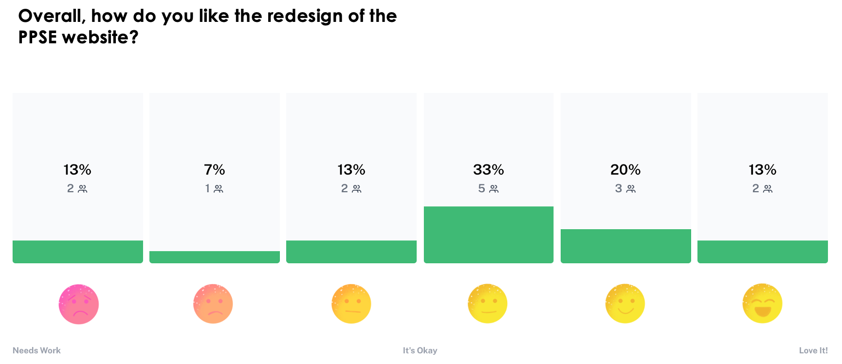
Changes to the layouts based on analytics data, user feedback, and the new design are quite different, and some users have grown comfortable with what they have. The online presence for mobile, tablet, and desktop enables consumers to find parts and accessories quickly.
Background
Introduction to the Platform
GPC (Genuine Parts Company) is a world-class distribution organization involved in automotive replacement parts and industrial replacement parts.
In relationship with NAPA, GPC grew its automotive business to become the largest automotive aftermarket network across the globe. To support NAPA Ecommerce, GPC launched few initiatives and PPSE being one of them. A platform which can help store owners find and order parts quickly for their customers.
Understanding the Problem
During this process, I brainstormed with my team in understanding the challenges that Store owners and customers face.
Our team started with market research by interviewing the past, existing, and potential Napa clients, and doing some competitive analysis to gather insight on the problem. We also interviewed PPSE vendors and business owners who are using the existing platform regularly. Understanding their pain points, provided some insights on how the platform can be improved.
User Research
To understand the problem further, in-depth user research calls were set up with our store owners, managers who deal with the customers regularly.

"We'd love to see the redesign of the PPSE website as the current homepage being too cluttered to the site being organized differently.
"It will be great to see the availability of the parts on the Pods as current Pods don't show the availability of the products in the store.

Research Analysis and Ideation
My team and I held a virtual brainstorming and ideation session with stakeholders.
We wrote down insights and quotes from the interviews on post-its and grouped similar post-its together. This led to four clusters that gave us an understanding of the most common issues regarding content creation.
Research Findings
•Older and not-intuitive UX
•Product Search was not user-friendly. A keyword search was the first step to find the product and then apply some constraints such as vehicle fitment.
•Less amount information was displayed on the Product pods (product sections)
•Users seem to have difficulty determining whether a part would fit in a vehicle or not.
Competitive Analysis
While the research findings allowed me to narrow down the problem, I needed some inspiration before wireframing. I looked at some of our competitors, like Autozone and Advanced Auto Parts.

Visual Designs
UI Designs
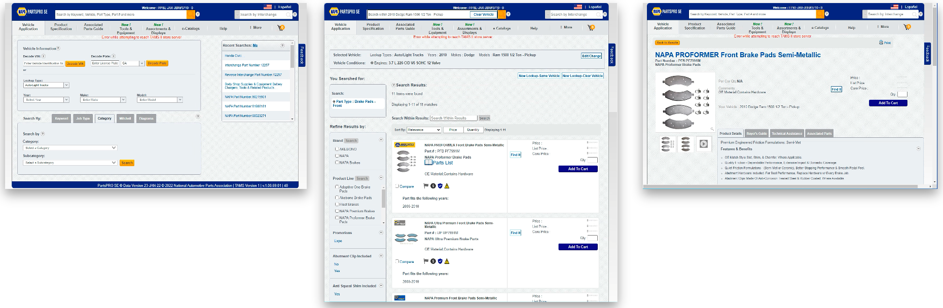
Before
After
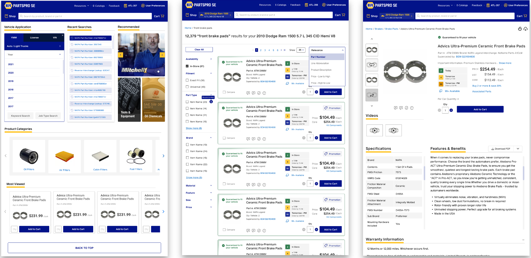
HomePage
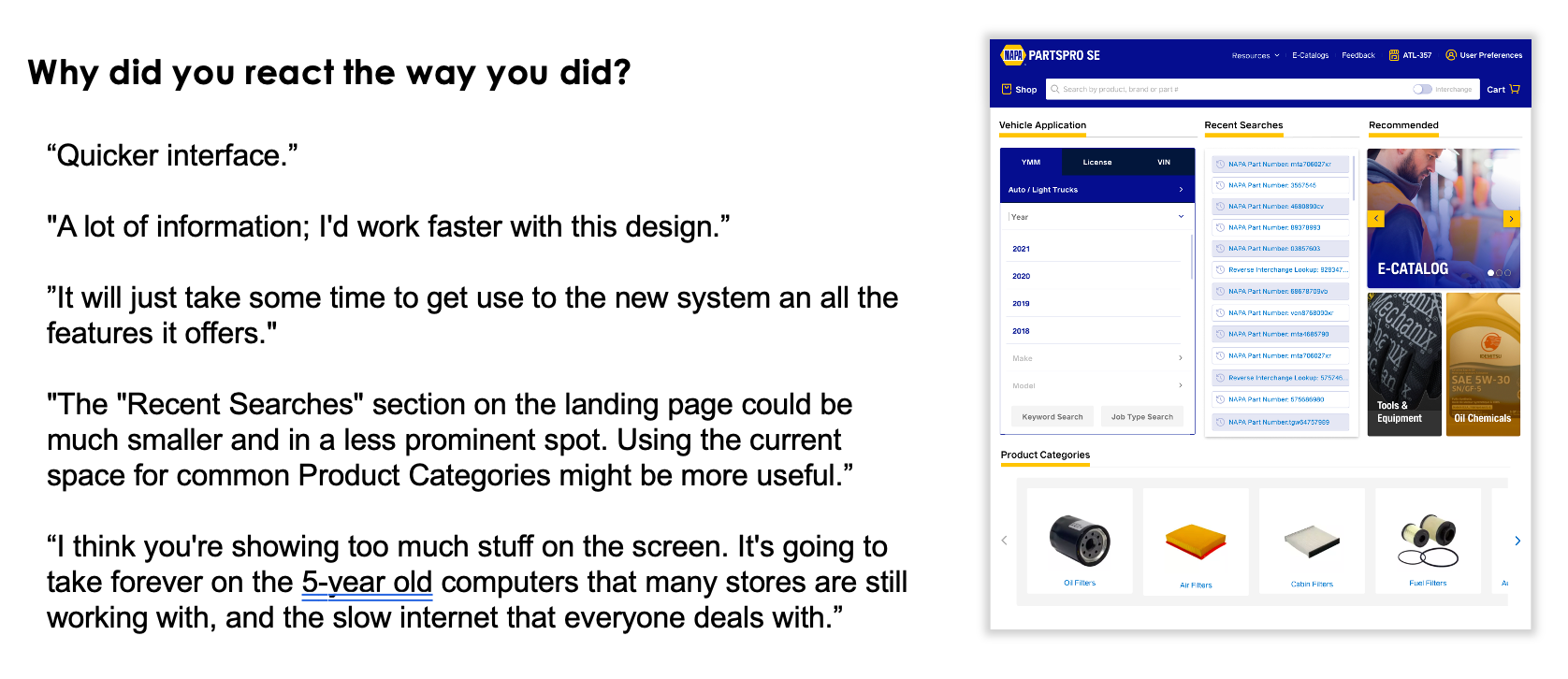
The home page is the main landing page which should have a complete view of the system and easy access to critical components. We allowed users to add a new vehicle to filter the parts easily on the homepage.
With this new homepage, Users can see their recent searches and recommended resources.
They can also view the product categories and most viewed products.
After adding the vehicle or selecting the products from the homepage, users can easily navigate to the interior page of the product landing page.
Users can quickly do the typeahead search to make the search easy.
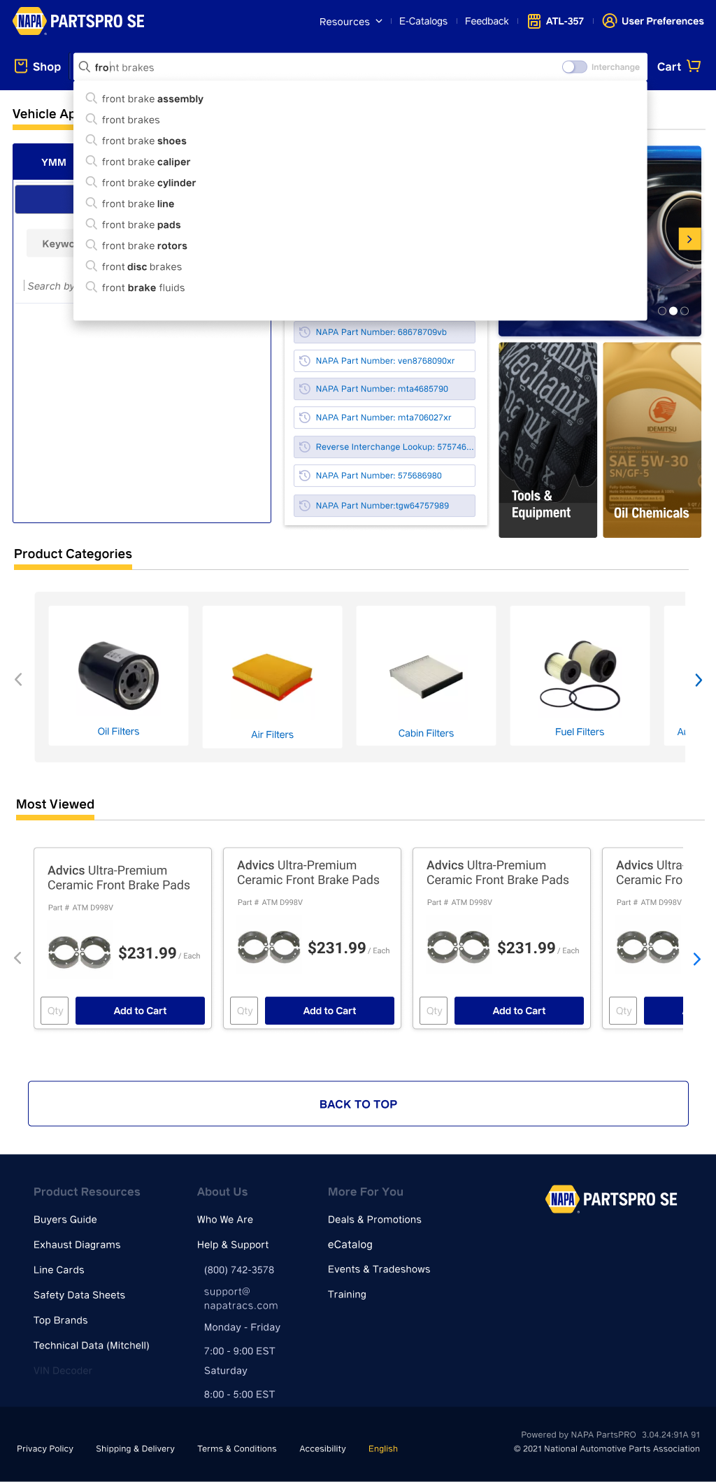
Users can easily add the Year, Make, and Model on the homepage
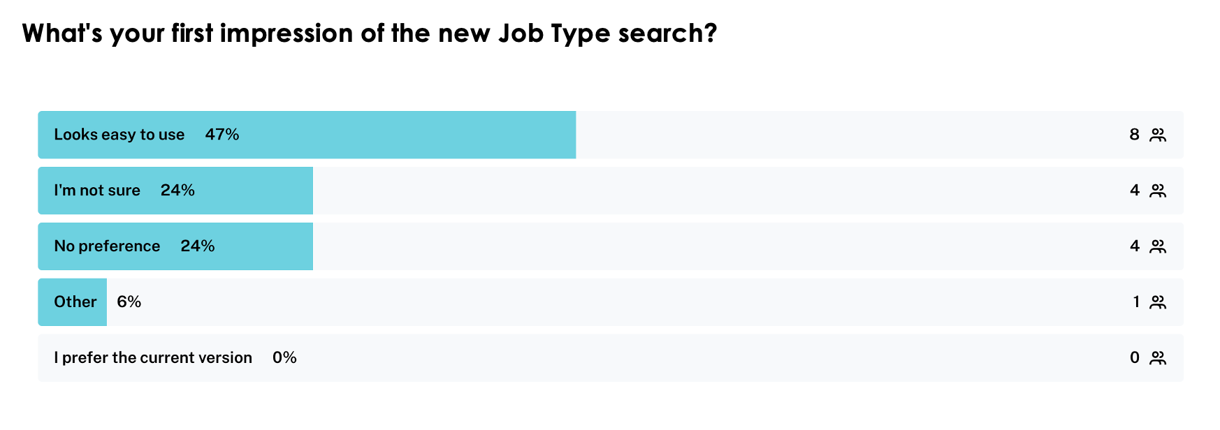
Users can easily add the Licence on the homepage and Jobtype search help the users to navigate the product and take it to the Product Landing Page.
Users can easily add the Vin on the homepage and keyword search help the users to search a part of the selected vehicle and take it to the Product Landing Page.
The Guarantee fit feature to work, users need to fill in the vehicle information at the header.
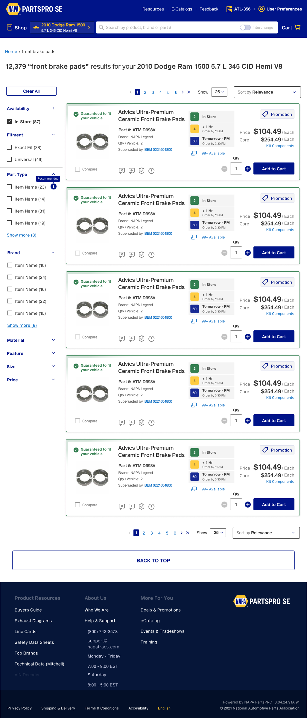
Product Landing Page
The goal of the Product Landing page is to provide summarized information about the product to the user. All the key information related to the auto-parts is provided.
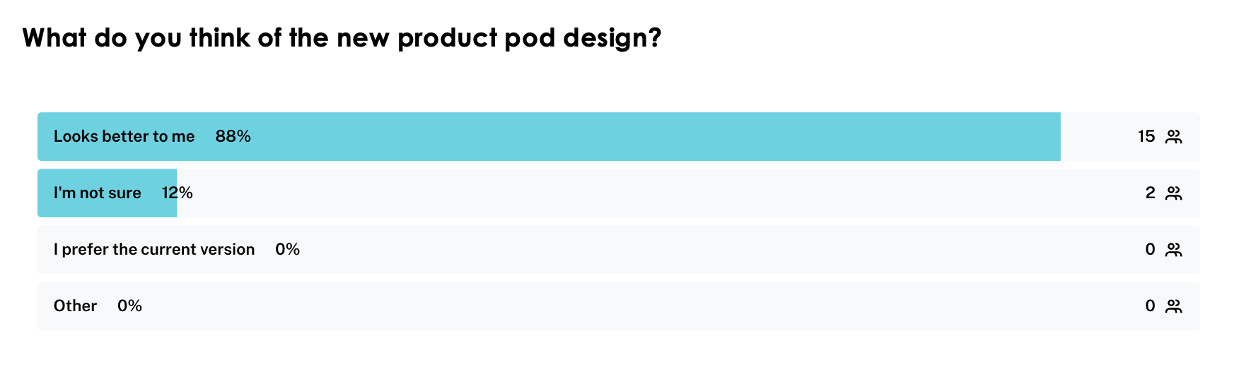
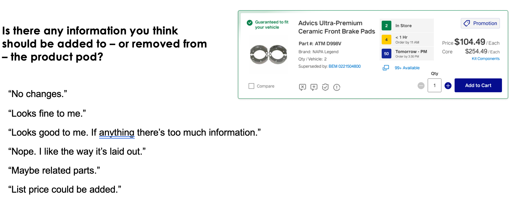
In the Product Pods, the three colored boxes with numbers in each will tell the user's the availability of the products.
Users can easily modify the vehicle information or add additional information from the header.
Users can quickly add parts to their cart with a simple click.
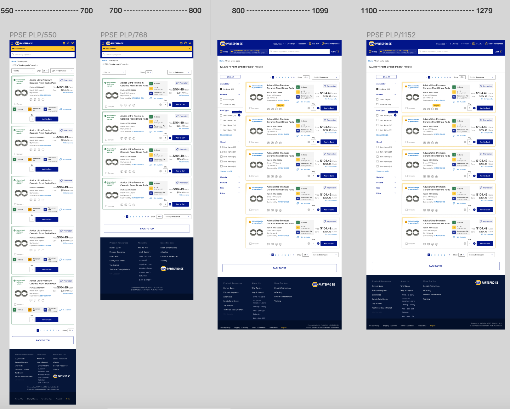
Breakpoint
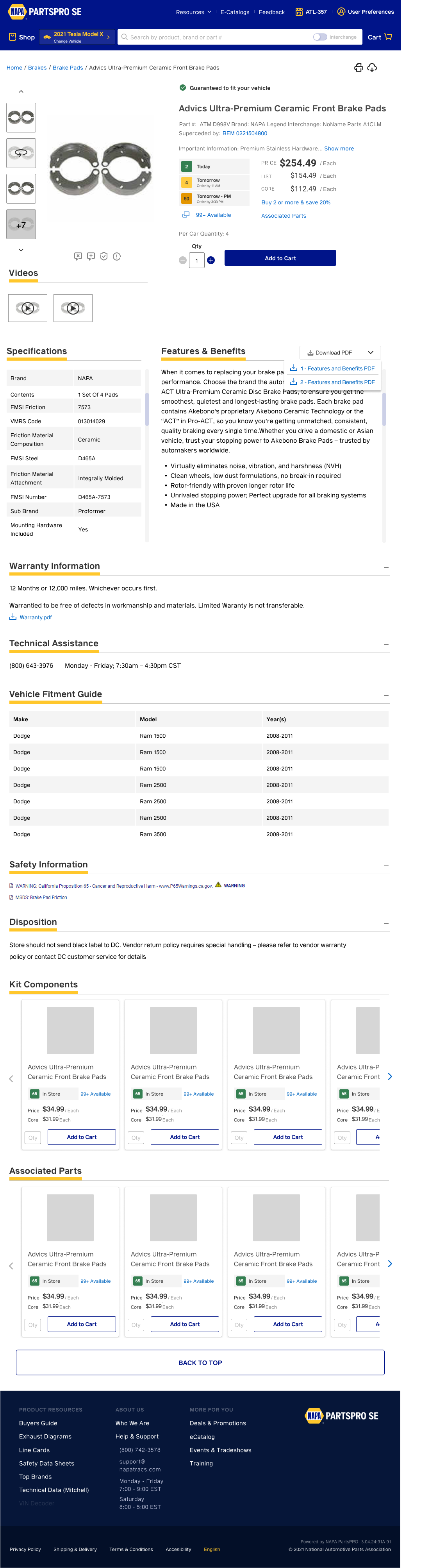
Product Description Page
The product description page goes a bit more in detail. Users are provided with some in-depth videos and images.
Users can easily view the specifications, features and benefits, vehicle fitment guide, and a lot more.
Product Compare Page
Different products from different brands can do the same job for a vehicle. It is essential to provide some comparisons to the users so they can make their judgments. On the product compare page, Users can easily compare a maximum of 8 products.
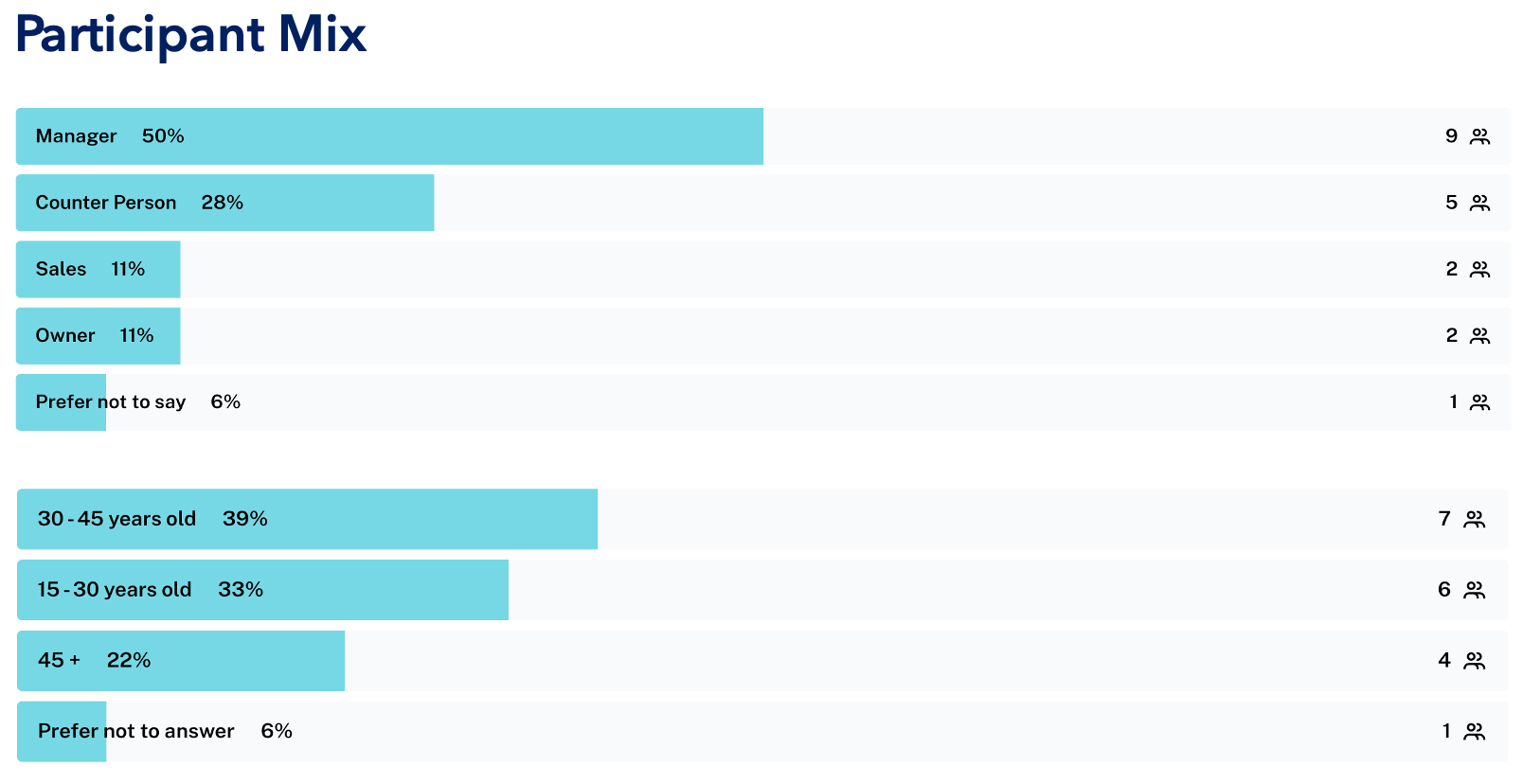
User Testing
• Goal was to obtain quantitative and qualitative data about ease of use and user impressions of the new PPSE. Test participants were a mix of PPSE users.
• Three moderated testing sessions and 15 automated testing sessions were conducted.
• All automated test sessions were conducted via Maze.co
• Moderated testing sessions were held remotely.
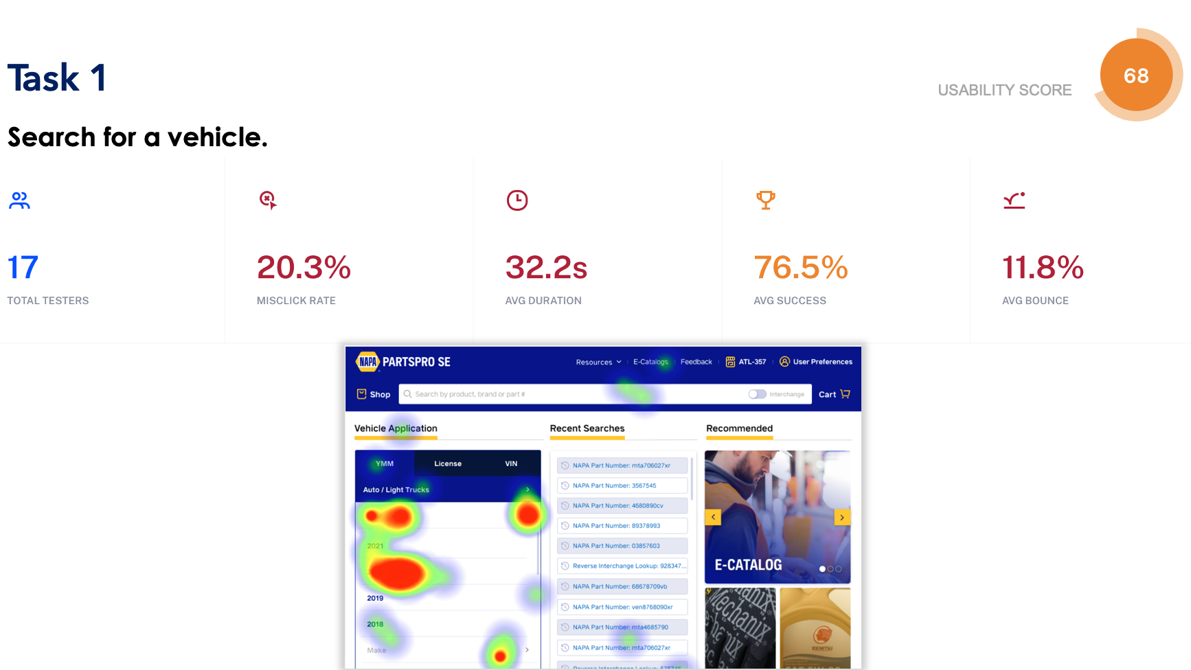
Analysis:
•Higher task completion time is likely due to the fact that this was the first interactive task, and users were still familiarizing themselves with the process. No other task in the test required nearly as much time.
•Users intuitively understood how the selection tool works, based on click volume and distribution on the page.
•The new vehicle selection tool is very different than the current PPSE, but users appeared to easily understand the process.
•Some users also appeared to automatically start with the keyword search tool. This emphasizes the importance of semantic search.

Analysis:
•Task completion took very little time once a vehicle was selected in the previous step.
•Users easily made a distinction between the keyword search in the header and the keyword search in the vehicle management tool.
•A small number of users began their search in the Recent Searches panel, demonstrating that this is commonly used for past vehicle searches.
•A small number of users instinctively began looking to the category search. This is indicative of the fact that some users consistently start their searches here.
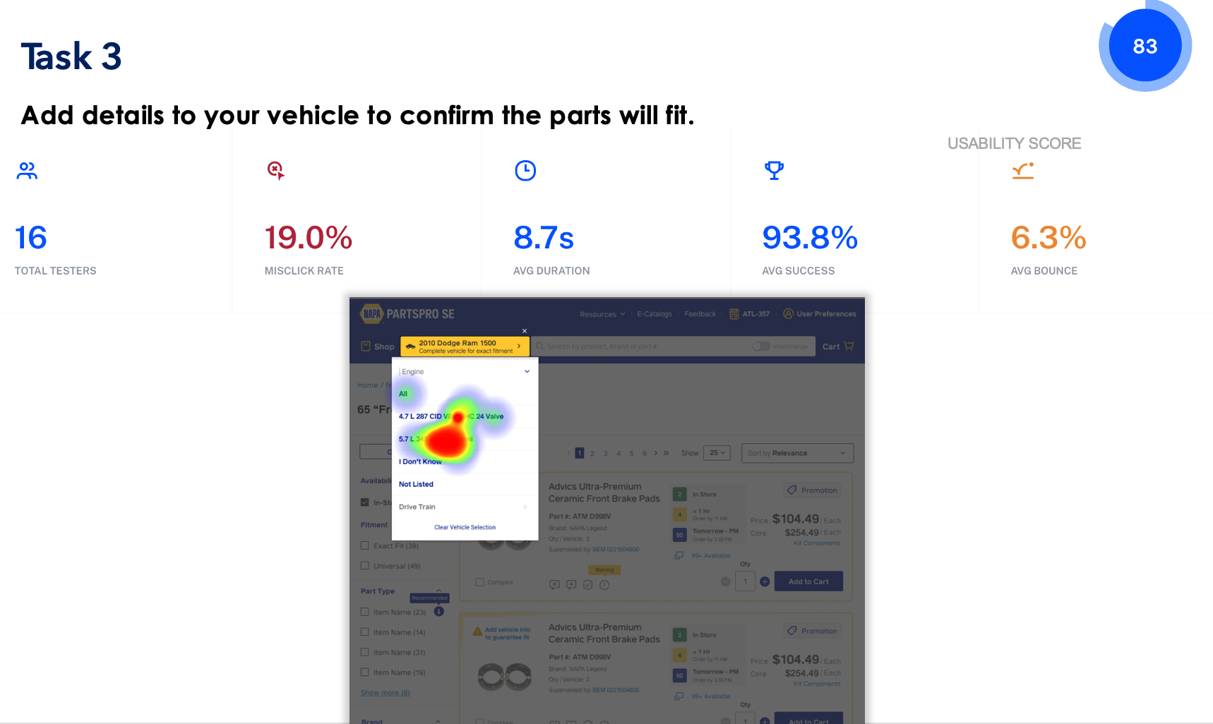
Analysis:
•Users quickly added conditions to the vehicle and knew how and where to select them.
•Almost every tester seemed to know that this process was essential to obtaining part fitment.
•A slightly higher number of seconds to complete this task indicates that users needed a moment to grasp the difference between the homepage vehicle selection process and the vehicle selection process on the interior pages.
•Testers were able to understand the difference between a vehicle with all conditions entered, and a vehicle that had only YMM information.
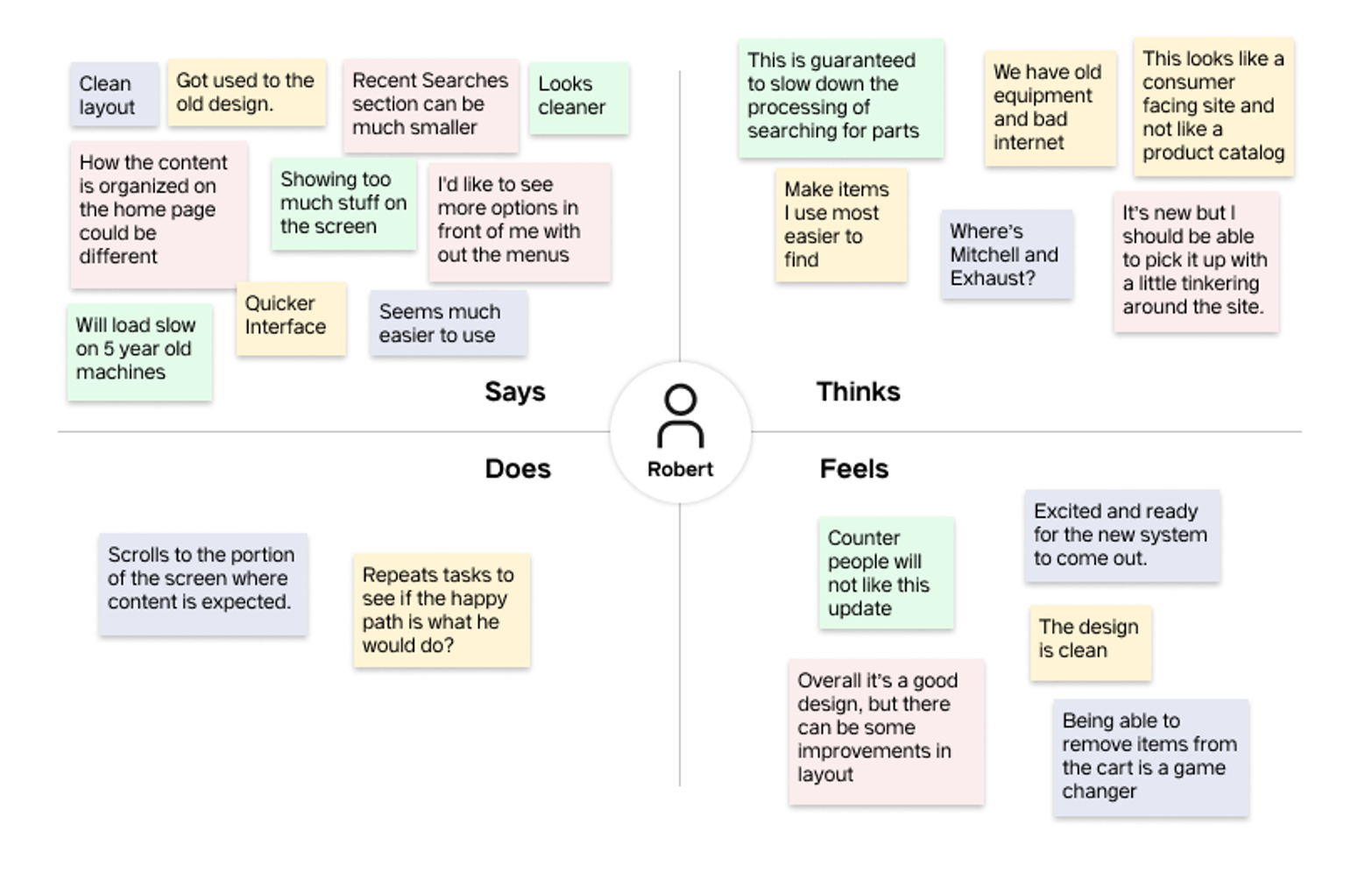
Empathy Map
We wanted to gather the sentiments of all the participants so we can have a global perspective of what the general audience thought. This will allow us to easily see areas we did right and others that could be enhanced for a better experience.
Next Steps
My experience at Genuine Parts Company was really rewarding and educational. I learned a lot about agile design workflow, business goals, feasibility, technical constraints of designing a product, research-driven design, rapid prototyping, and time management. It's exciting to work on a product that will impact business owners and customers. This modern design will help business vendors and employees get to the information fast and efficiently, saving time and resources. Based on the feedback from the stakeholders and testing assessment, I am currently working on a few design iterations.